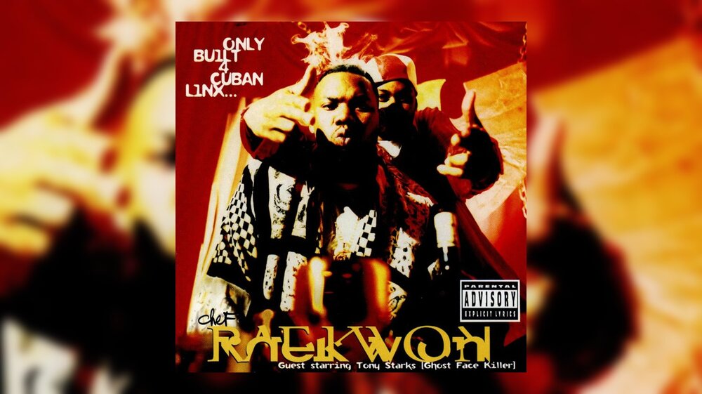
As television shows like The Get Down, The Breaks and Empire capture some of the rawness of the Hip-Hop music industry, Darius Wilmore, a Baltimore-based graphic designer and author, wants people to remember times where music was an experience and members of the industry invested in artists and helped to create that experience for fans.
Wilmores upcoming book, StereoTyped: Hip-Hops Unsung Graphic Design Heroes, Heroines, and the Oral and Visual Histories of the Rap Record (1979-1988, Full Circle Press, 2017), takes you on a journey where album covers, liner notes, live performances and real talent came together to give artists timeless careers.
With today’s anniversary of the first Sugar Hill album, Wilmore talks about the culture, his book, and the art of album covers.
***
The Shadow League: Can you talk about what The Sugar Hill album cover meant to you when you first saw it? Why was it unique? How did it set a precedent for Hip-Hop albums?
Darius Wilmore: Rapper’s Delight to me was a bug out for my 5 and 6-year-old ears and mind. I had been jamming off of Chic’s Good Times since it hit the radio airwaves earlier in the year of ’79. I dug the song but in the late summer of 1979, Rapper’s Delight hit and it was just a really bizarre experience.
We’d rap it on the school bus and in the elementary school lunch room. So, I was already deeply in love with rap music and Rapper’s Delight by the time, I came across the 12-inch vinyl single.
What stuck out to me was of course the illustrated syrupy looking candy cane style typography of the logo. But also, the background of the generic record jacket had an impact on me as well as it made the logo look and feel to me, as though it was hanging way up high in the sky. The background color was a beautiful sky blue and I loved that about it.
I would just stare at the logo and jacket and just imagine what forces could have brought this sound into existence. For me, and for many other people around the country and the world, it was the first sound of rap music and the first piece of commercial visual communication representing rap music and hip-hop that most people came into contact with, heard and saw.

TSL: Tell me a bit about your experience as a graphic designer during Hip-Hop’s golden age?
DW: I became a professional contributor to the commercial rap music industry as a graphic designer, art director, brand steward, and creative marketing strategist for Def Jam Recordings (and its group of rap music and hip-hop culture related joint ventures and partnerships). This occurred in the mid-1990s after I landed an internship in the label’s mail room while studying art at the School of Visual Arts in NYC.
Def Jam had its own in-house creative services department that doubled as a separate renowned design and film production company called Drawing Board Graphic Design/Drawing Board Pictures. It was a small crew of designers, four in total, led by the firm’s co-founders, Cey Adams and Steve Carr. The company did all of Def Jam’s visual communications work and work for many of the other rap and R&B record labels of that era (1989 – 2000).

TSL: What about that experience inspired you to write this book?
DW: My inspiration for the project came from my interest in rap music related to graphic design as a child (album covers, 12 inch single covers, artist and record label logos, photography, etc.) and growing up collecting records as a budding DJ.
Being an illustrator as a child, I was often compelled to recreate my favorite album cover typographic elements, the artists logos and the album titles, etc. Some years ago I began wondering about whom the artists and designers were who created the work I used to recreate and trace when I was younger.
So, I pulled out my old record collection and started looking through the credits and discovered that I either had never heard of the people credited for the work or, they simply were not credited at all. So, I thought that it was important to shed light on these people and the work they did. I figured that other people interested in rap musics commercial visual art might be interested in these individuals.
TSL: I found the correlations between punk and hip-hop interesting. I have heard the same correlations between hip-hop and go-go — both ultimately a youth-led, revolutionary approach to music. What made you choose Nick Egan as a subject for the book?
DW: Nick designed one of my favorite album covers of the 80s, Malcolm McLaren and the World Famous Supreme Team’s ‘Duck Rock’ album from 1983. I loved the design of that album cover.
Nick is a native Londoner and came out of the U.K. Punk Rock scene of the late 70s with Malcolm Mclaren, Sex Pistols and The Clash. His story is interesting because he witnessed both Punk and Rap develop. He made his way over to the U.S. just as Rap and Hip-Hop began finding their way into the commercial mainstream marketplace.
TSL: Michael Holman was another interviewee, the host of the television show Graffiti Rock, where audiences were given grade school style lessons on hip hop culture. Do you think there was a correlation between graffiti and art covers for Hip Hop albums?
DW: Yes. I interviewed Michael for the book as part of Nick Egans chapter on the events, times, and inspirations that lead him to create the Duck Rock album cover. He offered up some great insights into what was happening on the downtown Manhattan scene regarding the time of and the time leading up to Graffiti Rock.
For a while, graffiti style and aesthetics were somewhat synonymous with rap music’s commercial visual representation, up until the mid 80s, 85-86. So, yes, I would say that there was a correlation. Graf is one of the elements, some argue that it is a separate phenomena unto itself, of Hip-Hop culture born out of the same circumstances that birthed Rap music.
Theyre siblings in that sense and it would make sense that practitioners and producers of the music of Rap would look to graf to visually communicate the art form to the world outside NYC. But, graffiti and the commercial graphic design discipline are two different things.
TSL: Were album covers used to teach the masses about Hip Hop culture?
DW: Indeed. But, its primary purpose, like all other commercially sold products, was to market the music to the buying audience. The covers, being the main marketing communications item labels were willing to invest in at that time, were the primary way that fans of the music learned about the music and the accompanying subculture from which it sprang.
You could not regularly find rap music in music video form on MTV and/or BET and only a few songs found a home on black radio airwaves. White radio exercised a seeming complete ban on the music until Run DMC hit with Walk This Way in 1986.
So, no radio play, unless it was for a handful of hours on the weekends or an occasional single deemed non-abrasive, and no music video play. The only other outlets you could turn to in order to learn about the music and culture were live shows, which were few, and browsing the record racks at inner city record stores.
TSL: What’s the importance of the dawn of Hip-Hop happening at these independent labels? How did the fact that they were independent labels shape the cover art?
DW: Well, the first thing is that they were important because they gave the music a home it otherwise would not have had save for a few artists of that era, Kurtis Blow being the main rapper who comes to mind as he was signed to Mercury Records back in ’79.
You can make an argument that the music and culture could have dissolved, having never made its way outside of NYC and to other parts of the country and world if not for the indie labels.
Also, indie labels were free of the larger major label’s bureaucracy and hierarchy. They could afford to take risks and be daring as they had far less to lose and far more to gain by being on the cutting edge with how they communicate and market the music. The more daring and in your face the visual communications were the better the chance an album or single standing out and grabbing the attention of the potential customer. But, at the same time, Rap music is an abrasive, bold, loud, and in your face art-form. So, indie label or not, the form had to follow the function.
TSL: Whats your favorite Hip Hop album cover and why?
DW: Public Enemy’s Fear of A Black Planet. I still stare at the Fear album cover, front, back, and the liner notes, mind blown. It’s the greatest album cover of all-time in my opinion. When I first got my hands on the vinyl album in 1990, I just stared at it for hours! Public Enemy came across as if they were from the future.
Using NASA space image illustrators to create the cover. The yellow Star Wars style typography. A giant P.E. black planet with their logo in flames covering one side of it as it eclipses the earth. The image of the band on the back sitting around a table with a globe and a map, preparing an enemy invasion. It’s the greatest complete piece of music packaging that Ive ever seen.

TSL: These are not just biographies of the designers. The designers weave in stories about the culture that created the art and vice versa. Can you comment on that? Was there a reason why you intentionally expanded the focus to not just be about the designers and what their intentions were in creating the album covers?
DW: Once I began interviewing the designers and they started telling me their stories, it revealed a larger story about what was happening within the culture, the labels, NYC, and the country as a whole in terms of the larger context of what informed the music and the design work created by the designers and art directors who created it.
Also, researching the time period revealed an interesting narrative about the importance of graphic design to the selling of rap music during the rise of MTV, BET and the music video era.
That to me was far more interesting to explore than simply putting together a portfolio book of album cover images with accompanying anecdotes about how the work was created. Ive seen that before, many times and although I enjoy those types of books, for my own project, I wanted to offer something to people that contained information that they might not have known about.
TSL: How is cover art a lost art? Should we see a resurgence of it? If so, why?
DW: I dont think that its necessarily a lost art. From what I can see, if anything, its become a lost or at the least, a lesser experience. The experience and adventure of the sense of musical exploration, surprise, and discovery seems to have been lost as it pertains to album cover art.
Its a different time today. The internet and digital technological advancements have changed the way we experience music, discover it, and engage/interact with it once discovered.
The purpose and power of album cover art is lessened due to these changes. Should we see a resurgence?
Well, I think that a world without album cover art is darker world than one with them in it. The visual representation of music is a powerful and can be an inspiring experience for music lovers. Also, the further we travel into the future and the further we get away from the design and creation of tangible products like album covers, the more there might a return to an appreciation of said tangible items.
It likely wont be on the level of importance and singular experience as it was during the analog era of music. However, there will be a resurgence niche-wise for album cover art. From what Ive seen, I think that it is already starting to happen.


